Aleph Bet Of Israels Unity
The unity of God’s people Israel is a dream which as days pass seems further and further apart.
The connecting element of the people of Israel starts with God, surrounds the TaNaCh (Hebrew Bible aka “Old Testament”) and that connecting Jewish language be it Hebrew, Yiddish, Ladino, Mozarabic, Levantine Arabic, Aramaic & others which use the Hebrew alphabet as it’s base.
That alphabet which changed it’s shape during dramatically at each diaspora first the Egyptian exile from Proto-Sinaitic script to Paleo-Hebrew and then again at the Babylonian exile to Assyrian aka “Ashurit” script and during the Roman exile and developed styles according to the lands they lived cursive and block letters according to Jewish centers some in a more German (Ashkenazic) style others in more Spanish (Sephardic) styles, some easier for the modern Hebrew speaking Jew to read some very very difficult.
When one develops a a lettering style or font (typeface for printing) designers look for several things.
The first thing they consider is the purpose of the font.
What the font will be used for.
What message it should convey.
What is the audience that will be reading it.
What are the audiences expectations are.
The legibility of the font.
Is it easy to read.
Does it cause eye strain.
Aesthetics of the font.
The font looks good.
It fits in with the overall design of the project.
וַיֹּ֨אמֶר יְהֺוָ֜ה אֶל־משֶׁ֗ה עֲלֵ֥ה אֵלַ֛י הָהָ֖רָה וֶֽהְיֵה־שָׁ֑ם וְאֶתְּנָ֨ה לְךָ֜ אֶת־לֻחֹ֣ת הָאֶ֗בֶן וְהַתֹּורָה֙ וְהַמִּצְוָ֔ה אֲשֶׁ֥ר כָּתַ֖בְתִּי לְהֹֽורֹתָֽם׃(שמות פרק כד פסוק יב)
The LORD said to Moses, “Come up to me on the mountain and remain there, and I will give you the stone tablets with the law and the commandments that I have written, so that you may teach them.” (Exodus 24:12)
וַיִּתֵּ֣ן אֶל־משֶׁ֗ה כְּכַלֹּתֹו֙ לְדַבֵּ֤ר אִתֹּו֙ בְּהַ֣ר סִינַ֔י שְׁנֵ֖י לֻחֹ֣ת הָֽעֵדֻ֑ת לֻחֹ֣ת אֶ֔בֶן כְּתֻבִ֖ים בְּאֶצְבַּ֥ע אֱלֹהִֽים׃(שמות פרק לא פסוק יח)
When the Lord finished speaking to Moses on Mount Sinai, he gave him the two tablets of the covenant law, the tablets of stone inscribed by the finger of God. (Exodus 31:18)
וְהַ֨לֻּחֹ֔ת מַֽעֲשֵׂ֥ה אֱלֹהִ֖ים הֵ֑מָּה וְהַמִּכְתָּ֗ב מִכְתַּ֤ב אֱלֹהִים֙ ה֔וּא חָר֖וּת עַל־הַלֻּחֹֽת׃ וַיִּשְׁמַ֧ע יְהֹושֻׁ֛עַ אֶת־קֹ֥ול הָעָ֖ם בְּרֵעֹ֑ה וַיֹּ֙אמֶר֙ אֶל־משֶׁ֔ה קֹ֥ול מִלְחָמָ֖ה בַּמַּֽחֲנֶֽה׃(שמות פרק לב פסוק טז-שמות פרק לב פסוק יז)
Moses turned and went down from the mountain with the two tablets of the testimony in his hands. The tablets were written on both sides—they were written on the front and on the back.
Now the tablets were the work of God, and the writing was the writing of God, engraved on the tablets. (Exodus 32:15-16)
וַיֹּ֤אמֶר יְהֺוָה֙ אֶל־משֶׁ֔ה פְּסָל־לְךָ֛ שְׁנֵֽי־לֻחֹ֥ת אֲבָנִ֖ים כָּרִֽאשֹׁנִ֑ים וְכָֽתַבְתִּי֙ עַל־הַלֻּחֹ֔ת אֶת־הַ֨דְּבָרִ֔ים אֲשֶׁ֥ר הָי֛וּ עַל־הַלֻּחֹ֥ת הָרִֽאשֹׁנִ֖ים אֲשֶׁ֥ר שִׁבַּֽרְתָּ׃(שמות פרק לד פסוק א)
The New Tablets of the Covenant - The LORD said to Moses, “Cut out two tablets of stone like the first, and I will write on the tablets the words that were on the first tablets, which you smashed.
On the Stone Tablets that God gave Moshe on Har Sinai which were inscribed the Ten Sayings aka “Ten Commandments”. The words were engraved/inscribed (?) by the finger of God.
And God is writing on stone, the lettering on these tablets were done so be the ultimate designer, creator of the universe sky and land who had in mind a least all the above points.
The first thing they consider is the purpose of the font.
What the font will be used for.
What message it should convey.
What is the audience that will be reading it.
What are the audiences expectations are.
The legibility of the font.
Is it easy to read and understand.
Does it cause eye strain.
Has clear and simple shapes, avoiding too much ornamentation, and making sure the spacing is consistent.
The lettering should be legible, even from a distance. This means using large enough letters and making sure the contrast between the letters and the background is high enough.
Aesthetics of the font.
The font looks good.
It fits in with the overall design of the project.
Consistent throughout the piece. This means using the same font, size, and spacing throughout.
Balanced and visually appealing. This means using different weights and sizes of letters to create a sense of rhythm and movement.
Creative and original your own personal style and flair to create something unique.
When God designed the stone tablets, what did he have in mind?
For what? For the Stone Tables.
What was the purpose of the ten saying? To give a base for instructions on how to live under and with God.
What was the project? A creation that this is the singly one time written sayings that he put forward unto mankind written by himself and not via a third party prophet. does he wants to bring forward the that the fact that he’s putting it forward himself?
To who did he plan to give these tablets to? He was given to the people of Israel like spent the past 400 years as enslaved people in the land of Egypt.
What experience does God want? The people of Israel who received the tablets already exclaimed “We will do and hear” (Exodus 27:7) the ultimate complete acceptance of going forward and doing whatever God wants and God shows them and will serve them and bring themselves completely in his hands
Is is a one-time project or one for the future to come? We can see that the outcome of this project as written was to put a copy of the original tablets in the ark of the covenant. So God’s design was one for future generations they would be able to see and read and understand what was written. But this is only true for the post Egyptian exile population but also those who grow up and lived in the land of Canaan as for the post Babylonian exile the people did not have the copy of the ten saying nor the ark.
So the first thing that we know here is that the language and script that they were accustomed to over the past 400 years was the Egyptian script that existed in there surroundings.
A possible example would be Proto-Sinaitic  from [https://www.ancient-hebrew.org/biblical-history/ten-commandments-in-hebrew.htm]
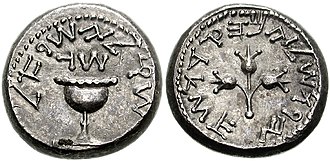
The last lettering used by the united people of Israel would be Paleo-Hebrew. even pre Babylonian exile the nation was already divided and partially exiled. The dream of a united nation was repeated in the Prophets many times, as well as in the revolt that took place before and after the destruction of temples.
exampled in use of paleo-hebrew on the first Jewish revolt coinage was issued in 66 ce
and second revolt 135 ce.
Hebrew type of the Modern Era
During the renaissance of Hebrew as a not just religious language from the late 18th century (The Haskalah, the Jewish Enlightenment) development of fonts for books and newspapers helped create the Modern Hebrew Type.
The beginning of the 20th century provided a space for the progression of Hebrew typography as the possibilities of Israel becoming a Jewish state increased efforts in the promotion of a Hebrew revival. Unlike the historical transformation of Latin letterforms, which had been studied and anatomically structured since the Renaissance, Hebrew type did not experience major historical reform and improvements. According to Adi Stern, President of Bezelel Academy in Jerusalem, “The rules that regulated the writing of Hebrew text caused very little processes of change.” During the 20th century, however, a thorough examination of the Hebrew script from Jewish historical documents and objects resulted in the experimentation of Hebrew typeface designs. An increased population of immigrants influenced the growth of industry, in Eretz Israel, and necessities in the production of documents created a demand in the designing of modern Hebrew typography. Letterforms were to be perceived as complementary to the Jewish cultural identity and where developed through the research of ancient and historical texts. The favoured typographic styles integrated two major Hebrew scripts; Ashkenazi, formed in Europe, was influenced by Blackletter, a Medieval Gothic writing system used in Christian illuminated manuscripts. Letterforms were blocked with thick, bold horizontal strokes and contrasting thin vertical lines extending at the edge. In contrast, Sephardi script, developed in the Iberian Peninsula, the Middle East and North Africa, was influenced by Arabic calligraphy by which letterforms were placed closely together, appearing delicate with soft, organic curvilinear lines. source [https://digitalcommons.xula.edu/cgi/viewcontent.cgi?article=1045&context=fac_pub]
Renowned typographers and hebrew fonts of the modern era.
Rafael Frank - Frank-Ruehl 1910 - in collaboration with Auto Rühl. It was a new letter unrelated to any tradition – neither of the beit midrash nor the writings of the Haskalah. But surprisingly, even religious people used it. Many Israeli books, newspapers and magazines use Frank Rühl as their main body text typeface.
Miriam - uniform line thickness, slightly rounded corners, and simple letter shapes.
Yaakov Haim Levitt (Jan Lewitt) - Haim 1930 -new sans-serif designs of the “Bauhaus” ascola. It is of important stature in the history of Hebrew type evolution, because it introduced the letter’s primary strokes not as blueprints of a typeface, but as an independent typeface of its own. Originally produced by the Warsaw based typefoundry Jan Idźkowski i S-ka in 1929 for the Yiddish market, Haim became very popular for headlines and titles in Palestine in the 1930s.
Henri Friedlaender -Hadassah 1958 - legibility typeface, interpreting the traditional “serif” letter through a Modernist esthetic. Its robust weight, low stroke contrast, open counters, simplified forms, and somewhat rigid appearance make it easily readable at small point sizes. It was based on Ashkenazic letterforms, but as the designer minimized the contrast between the strokes to make it more readable even at small point sizes.
Ismar David - David 1954 - planned each letter to fit on the same matrix and line up on the same baseline, in order to work on the line-casting machines then prevalent. By devising a scheme to divide the alphabet into three groups based on width, he was able to achieve a solid structure and a more even texture than was generally seen in Hebrew typefaces of the day. He tested and refined his design over years by pasting up letters in a wide variety of commercial graphic applications. The David typeface was a Hebrew family of type in three styles – upright, italic and sans serif – with each in three weights. David’s design was the antithesis of early twentieth century Hebrew typeface styles, which tended to be heavy and ornate1. Ismar David distilled the essence of Hebrew letterforms and characterized them with his own sense of design.
Zvi Narkis ־ Narkiss 1950, seemed have less personality, and therefore to be more universal (figure 19, top). It was better suited for magazine and newspaper composition. It is more monotone then Narkiss Linotype and more uniform in construction. The Sephardic sharp corner on the bottom of “ , 0, and W was replaced by an Ashkenasic round bowL These foreign forms in an otherwise Sephardic letter achieved greater distinction between the characters and help the readability of The Narkissim font during the 1980s. It is a soft and gentle text typeface made for continuous reading. The font was designed for phototypesetting technology.
Fransizka Baruch - Rambam, Rahel, Staam Hasofer 1933
Eliyahu Koren created two fonts, Koren Bible Type and Hebrew Book Type1. He created Koren Bible Type for the specific purpose of printing The Koren Bible, published by Koren Publishers Jerusalem in 19621. The Koren books use two fonts created by Eliyahu Koren: Koren Tanakh Font and Koren Siddur Font. Koren Publishers Jerusalem has been restoring the original Rashi font in the 21st century.
Theo Tzvi Hausmann together with Moshe Spitzer designed the Hatzvi typeface. Hatzvi was first cast by the Jerusalem Type Foundry in a bold weight as their first original design in 1956. Later extended with Light, Open (1958), and Medium styles.
Tuvia Aharoni designed the Aharoni font
Asher Oron created Oron font 1966 To be used together with Latin letters in various items, the Latin letter Univers (designed by the Swiss designer Adrian Frutiger) . In addition to the formal qualities of these letters, they had two other important features: they were designed in advance as a series consisting of weights - of varying degrees of thickness and width - and they were specially designed for the photo arrangement method.
Lettering styles
While there are many lettering styles that are not inclusive to specific languages. Some examples include:
Block lettering: This style is often used in signage and other applications where a clear and concise message is needed. However, it can be difficult to read in languages that use diacritics or other special characters.
Script lettering: This style is often used for decorative purposes. However, it can be difficult to read in languages that have a lot of ascenders and descenders.
Cursive lettering: This style is often used for personal writing. However, it can be difficult to read in languages that have a lot of complex characters.
Calligraphic lettering: This style is often used for formal documents and other applications where a high level of artistry is desired. However, it can be difficult to read in languages that have a lot of unique characters.
Serif: Serif fonts have small lines or flourishes at the ends of the strokes that make up the letters. They are often used in printed materials such as books and newspapers.
Sans-serif/Modern: Sans-serif fonts do not have the small lines or flourishes at the ends of the strokes that make up the letters. They are often used in digital media such as websites and mobile apps.
Script: Script fonts look like handwriting or calligraphy. They are often used for invitations and other formal documents.
Display: Display fonts are designed to be used at larger sizes, such as for headlines or titles.
Monospace: Monospace fonts have equal spacing between each character, which makes them useful for coding and other applications where precise alignment is important.
Handwritten: Handwritten fonts look like they were written by hand. They are often used for personal projects such as greeting cards and invitations.
Blackletter: Blackletter fonts have a Gothic or medieval look and feel. They are often used for titles and headings in printed materials.
Art Deco: Art Deco lettering styles were popular in the 1920s and 1930s. They often feature geometric shapes, symmetrical designs, and a sense of glamour and elegance.
Graffiti: Graffiti lettering styles are inspired by street art and often feature bold, exaggerated letterforms with decorative elements and vibrant colors.
Retro/Vintage: Retro and vintage lettering styles evoke the design aesthetics of a particular era, such as the 1950s or 1970s. They can include various elements like bold letterforms, embellishments, and distressed textures.
The Unifying font
When looking at the past we also see a future of Israel’s redemption and ultimate unification as a people.
What do we see as such:
וַיְהִ֗י בִּרְאֹתִ֛י אֲנִ֥י דָֽנִיֵּ֖אל אֶת־הֶֽחָזֹ֑ון וָֽאֲבַקְשָׁ֣ה בִינָ֔ה וְהִנֵּ֛ה עֹמֵ֥ד לְנֶגְדִּ֖י כְּמַרְאֵ֥ה גָֽבֶר׃(דניאל פרק ח פסוק טו)
The tribes of Israel each have their own independent individual diversity. This is found to be difficult to bridge not only today but in essence since the creation of the people of Israel out of twelve brothers of four (five including Joseph’s wife Asenath, “the daughter of Potiphera, priest from the city of On) mothers each with their own “flag”.
Each with its own purpose and style, giving space, allowing room and having full acceptance of the other without undervaluing the other nor themselves. Such the tribes work at times in unison, and at other times separately.